When I just started building trading algorithms for intraday power trading, I was full of excitement. There lay an ample selection of well-established technical tools from the financial markets that I thought I could swiftly apply to energy products, and follow a typical development pipeline in quantitative trading to build a profitable algorithm.
Needless to say, my hopes of swift application of established quantitative strategies (for instance, trend following or trading momentum and mean reversion) lay shattered due to fundamental differences between the financial market and the intraday energy market. However, algo trading is an exciting discipline where such challenges can be overcome. At Brady Technologies, we have focused on this gap in the market to develop state-of-the-art, profitable market-beating algorithms for short-term energy trading.
Brady’s solution ‘PowerDesk Edge’ is rooted in using algorithms and data science to super charge our customers’ trading strategies. It is a key component of our new offer for the modern prompt power trading desk.
In this blog post, I investigate challenges that a typical power trading desk faces, namely:
- Discontinuity
- Non-rollability
- Pseudo-continuity
Continuity
One major difference between intraday energy markets and more popular financial instruments – be it stocks, foreign exchange (forex), funds, bonds or crypto – is non-rollability, or extremely quick maturity.
The chart below shows the Year-to-Date (YTD) price action of the European Union Carbon Allowance (EUA) futures with month-ahead delivery.
A future contract has a physical delivery date, which is at the end of the following calendar month.
A future contract like EUA also imposes obligations on bilateral trade – sellers must deliver EUAs to the buyers.
The key takeaway from this type of product is its “rollability”, or “continuity”, meaning the future contracts can be rolled forward before expiration. For example, on 30th of November the month-ahead future will have a delivery in the end of December, but on 1st of December the same month-ahead future will have a delivery date rolled forward into end of January.
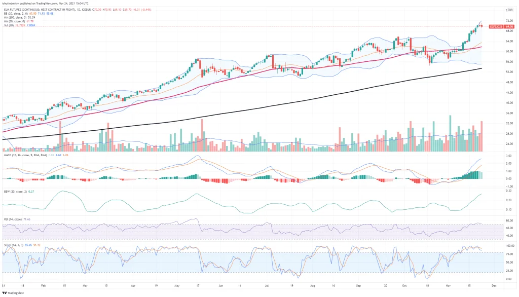
Figure 1. YTD EUA month-ahead future with technical indicators
I added the following indicators to this chart: Bollinger Bands, 50- and 200-day Exponential Moving Averages, Volume, 20-day Moving Average Volume, Moving Average Convergence Divergence (MACD), Bollinger Bands Width (BBW), and Relative Strength Index (RSI).
Technical indicators help traders discover and act on unwinding price patterns. Basic technical analysis of any financial instrument does not require detailed knowledge of that instrument. As long as the chart represents the action in a freely traded market, a technician does not even need to know the name or type of the security to conduct the analysis. Technical analysis can also be applied over any time frame—from short-term price movements to long-term movements of annual closing prices. Trends that are apparent in short-term charts may also appear over longer time frames.
While technical analysis is ideal for short-term trading decisions or tactical asset allocation decisions, long-term chart analysis can add value regarding strategic asset allocation or long-term investment decisions. Looking at recurring technical clues on multiple time intervals (monthly, weekly, daily, 60-minute charts, etc) can be a particularly useful technique.
Sounds like a great combination of tools to use in short-term energy trading to predict price directions?
Wrong!
Discontinuity
Technical indicators require historical data. Typically, most indicators stem from some rolling averages or rolling standard deviation calculated over several periods – say, 20 days, or 20 hours, and so on.
Continuous time series data has four crucial statistical properties that quantitative strategies are based on:
- Trend
- Seasonality
- Error
- Stationarity, that can be derived from the above three properties
Conversely, discontinuous data does not possess such properties, hence makes application of technical strategies for algorithmic energy trading nearly impossible. So, what do intraday energy prices look like?
Let’s consider historic intraday GB power prices in the series of candlestick charts below.
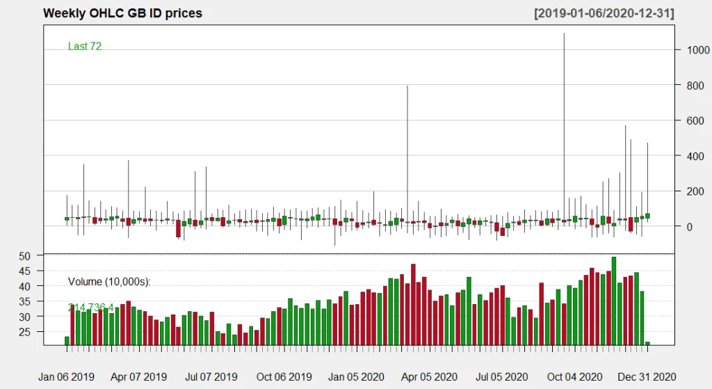
Figure 2. Weekly OHLC GB intraday prices
The chart depicts prices in the top panel and associated volume in the bottom panel. Each candle corresponds to 1 week. Unlike in the example with EUA prices, we do not observe a significant trend, however we do note a significant degree of price volatility indicated by wide shadows, especially towards the end of 2020.
Let’s change granularity and plot Open-High-Low-Close (OHLC) prices for each day.
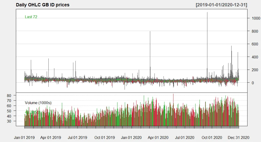
Figure 3. Daily OHLC GB intraday prices
The chart gets really cluttered and we need to zoom in. I chose to zoom in Q4 2020 in the chart below.
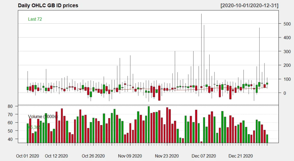
Figure 4. Daily OHLC GB intraday prices Q4 2020
Once zoomed in, we see that intraday GB power prices started to trend slightly upwards in Q4 2020. If we compare the daily EUA price chart from above with the daily intraday GB power prices, we will notice two major differences:
- EUA prices possess a clearer trend and low within-day volatility.
- Power prices possess a less clear trend and extremely high within-day volatility, the latter being depicted by wide shadows on almost every day.
I zoomed in further, but this time I plotted one week of intraday GB power prices between 2 and 8 November 2020 at the highest level of granularity – half-hourly. In this example, each candlestick illustrates:
- Price that a given half-hour opened at;
- Price that a given half-hour closed at;
- Maximum and minimum price that a given half-hour traded at during its trading window.
Effectively, each candlestick summarises trading activity of each half-hourly period by showing the price range and total traded volume.
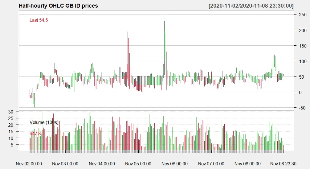
Figure 5. Half-hourly intraday GB prices
From this chart we observe sharp price fluctuations, lack of a clear trend, and troughs in traded volume that seem to have been occurring at fixed intervals.
The reason I mention trend so often is because it is one of the key factors in quantitative strategies: prices follow trends, which move directionally — upward, downward, sideways, or in a combination of these directions. Once a trend is recognised, the expectation is that any future movement in the price of the asset will follow that trend rather than go against it. A trend in motion is more likely to continue than to reverse. An important corollary is that a trend in motion will continue until it reverses. Indeed, a common saying among technical analysts is, “the trend is your friend.”
In case with power prices, long-term trends are virtually non-existent as price moves sideways, while volatility around some sort of a “fair” value remains high – this poses significant challenges for adoption and facilitation of algorithmic energy trading.
The reason why intraday power prices – not only in GB, but in all markets – move in such patterns is due to their discontinuity. Short-term power products have physical delivery time slots. In GB, they are half-hourly – e.g., from 12:30 until 13:00. Hence, short-term power futures with 48 expiration dates every day should not be treated as a continuous time series of just one asset (power). Instead, it should be treated as 48 different, disaggregated time series for each delivery period – e.g. half-hour 1, half-hour 2, and so on.
Non-rollability
Discontinuity of power prices makes application of quantitative strategies very difficult.
Question: Why can’t a trader use a half-hourly time series to work out price patterns?
Answer: Although intraday periods are settled half-hourly, this is not technically the highest level of granularity. This is where the concept of non-rollability kicks in.
I plotted half-hourly candles in the chart above for the first week of November 2020. However, underneath each half-hourly candle there lies a whole bunch of by-second trading activity – see example below for half-hour 25 (delivery start 12:00) on 02 November 2020.
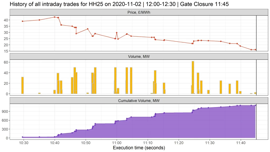
Figure 6. History of all intraday trades for HH25 on 2020-11-02
Trading activity for HH25 on 2020-11-02 (Monday) started around 10:30am, roughly 75 minutes before gate closure at 11:45. The chart depicts all trades on the market that occurred during that timeframe, alongside their corresponding volume and cumulative volume for that period. The first trade opened around £40/MWh, ramped up a bit, and then reversed to close at around £15/MWh, which was roughly 62% below market open.
Can you imagine such volatility on the stock market, happening within 75 minutes? The reasons for such a fall could be fundamental changes on the market – for example, warm weather, long system, excessive renewable generation, etc. Volume was quite evenly spread and totalled about 1 GW.
Let’s fast forward one day and look at the same period on 03 November 2020.
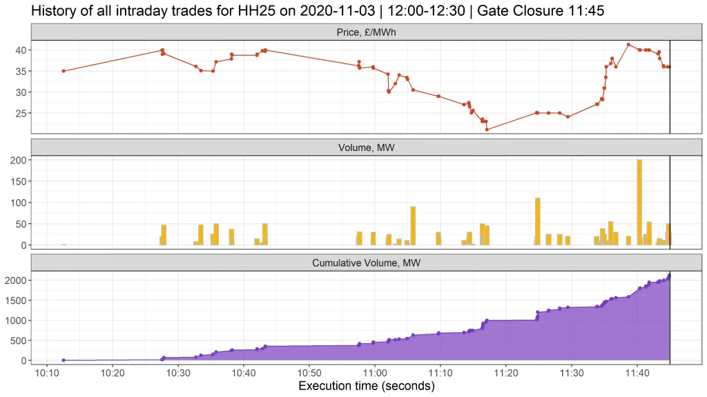
Figure 7. History of all intraday trades for HH25 on 2020-11-03
We observe that:
- Trading commenced around 10:10am – 20 minutes earlier than the previous day.
- Price opened at around £35/MWh, remained rangebound until 11:05, plummeted at 11:20, surged at 11:35.
- Volume was distributed unevenly – more trading took place towards gate closure as time was running out.
- Twice more volume traded compared to the previous day.
We could delve into more details to explore how trading patterns vary between days and half-hours, as well as understand the fundamental reasons why they vary – but that is a subject for a different article. However, what is important to highlight is the fact that trading activity only emerges some time before gate closure when it falls on the radar of prompt traders.
And once time is beyond gate closure, that is it – the product is about to deliver, no more trading is allowed, and most importantly the product cannot be rolled forward. At the same time, it is unlikely that a given product would be trading significantly in advance of its delivery since prompt traders would be focusing on the near-term half-hours / hours due to the time constraints.
To observe the complexity, imagine that you were a prompt trader and you wanted to view market activity just for 5 trading periods on 03 November 2020 delivering between 12:00 and 14:30 – this is what you would see.
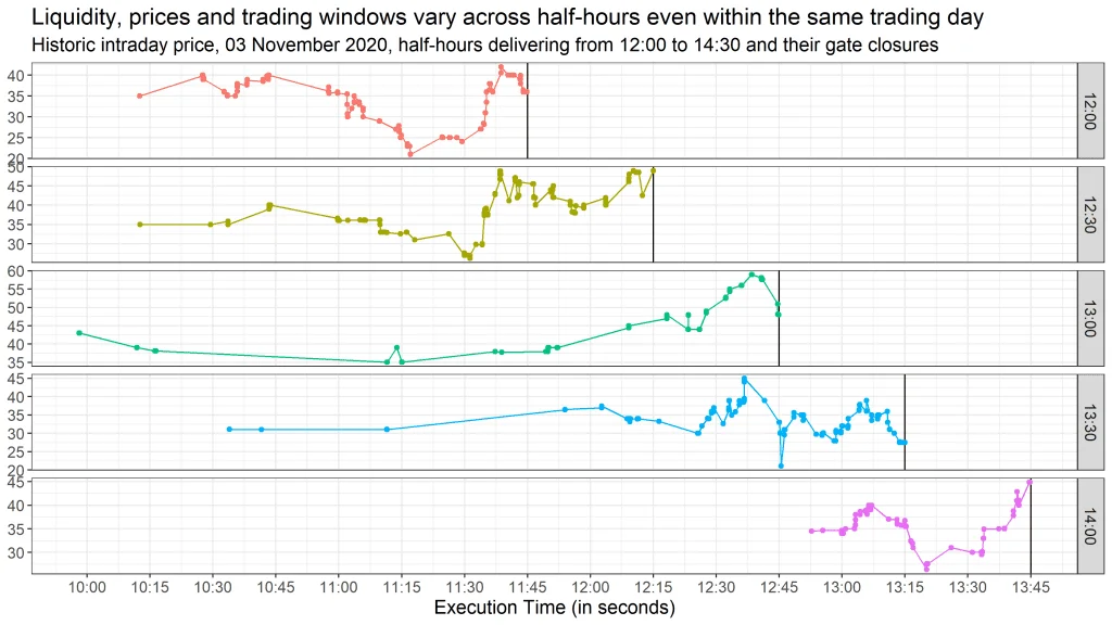
Figure 8. Trading activity for 5 consecutive periods on the same trading day
Observe how each of these products – although they are all consecutive and belong to the same trading day – have:
- Different trading windows – that is, the duration of when a product starts and finishes trading.
- Different price levels – for example, period starting at 12:00 closes flat vs. open, while period starting at 12:30 opens at £35/MWh and closes at £50/MWh, a 45% jump within an hour.
- Different liquidity levels – for example, period starting at 13:00 first traded at around 10am, however this was followed by a still period of no trading, which accelerated activity towards gate closure.
These factors take place due to non-rollability of energy products – each product has fixed delivery slots, is based on different fundamentals, and cannot be rolled over into a consecutive period. Being constrained by product non-rollability, market participants chose themselves when they want to stimulate liquidity by initiating an order, or when they want to hold off trading and execute at a price that seems favourable.
On Forex markets it is common to continuously hedge financial exposure and downside risks with spot and forward contracts. Once an FX forward reaches a settlement date, it is possible to roll it forward. Traders can also apply potential changes in hedging strategy by rolling given contracts to different expiration dates or prices. Rolling also provides liquidity to the product as traders will sell and buy the contract of different expirations before expiration. This is not possible in the short-term energy market.
Pseudo-continuity
With discontinuity and non-rollability attributes of short-term energy products in mind, is there anything a trader or a quantitative analyst can do to predict price movements? Do continuous energy products have at least some sort of relationship and dependency that we could leverage akin technical analysis to make a price prediction? It turns out, they do.
To gauge price patterns by half-hour, let us explore how intraday GB prices were distributed in 2019 and 2020.
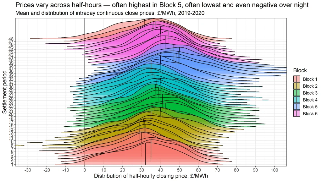
Figure 9. Distributions of historic intraday closing prices
The chart above shows such distributions colour-coded by block, like in clustering analysis. Although there were several occurrences of prices below -£30/MWh and greater than £100/MWh, I excluded them from the chart margins for visualisation purposes. Unsurprisingly, peak periods (Block 5) possess higher average prices and wider distribution, where the latter indicates high dispersion and volatility. Overnights (Blocks 1 and 2) possess the lowest average prices and narrower distributions – indicating lower dispersion and volatility. Looks like some similarities and patterns, finally!
From the chart above we see that distributions’ average prices form some sort of shape – is this shape consistent across days, and if yes, could we use it to our advantage? To answer that, I took closing prices for each half-hour of each day in 2019, extracted a daily seasonal component and overlaid 365 seasonal components in a single chart.
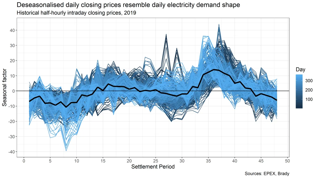
Figure 10. Deseasonalised historical half-hourly intraday closing prices
The deseasonalised shape looks remarkably similar to a daily shape of national electricity demand, which makes sense given that higher demand should drive prices higher, and vice versa. It looks like yet another pattern that we could use for price prediction!
Knowing there is a repetitive shape in intraday prices across days allows us to ask the following question – is there a relationship between consecutive half-hours, regardless of their discontinuity and non-rollability? In other words, if the market price for half-hour 11 goes up, can we with a certain degree of confidence predict that prices in half-hours 12 or 13 are also likely to go up?
To answer that question, we need to explore the concept of autocorrelation – correlation of a series with itself.
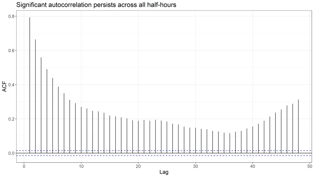
Figure 11. Autocorrelation of closing prices in 2019 by half-hourly lag
The chart above confirms that significant correlation exists across all half-hours. However, such a correlation is deceiving because it does not tell the full story. The disadvantage of autocorrelation is that it propagates itself forward – in simple terms, it does not calculate “pure” correlation between consecutive periods and there is correlation “spill” into subsequent periods. Partial autocorrelation addresses that.
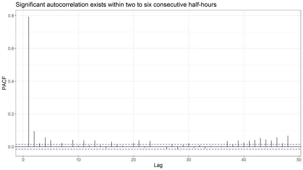
Figure 12. Partial autocorrelation of closing prices in 2019 by half-hourly lag
Removing “spilled” correlation indicates that the strongest relationship exists between neighbouring half-hours (spike at lag 1), however some correlation is also observable between products that are up to five half-hours apart.
Overall, the charts of GB intraday closing price distributions, deseasonalised daily shape and autocorrelation suggest that despite fundamental discontinuity and non-rollability that complicates application of technical analysis, half-hourly energy products do have some relationship, albeit it is short-lived and is especially pronounced for adjacent periods. I call this type of behaviour pseudo-continuity.
Conclusion
In this article I discussed and illustrated three distinct features that separate short-term energy products from common financial assets – discontinuity, non-rollability, and pseudo-continuity. These features stimulate quantitative analysts and traders in the energy markets to seek new strategies of working that are distinct from the financial markets. We leveraged such strategies at Brady to deliver profitable trading algorithms under our solution PowerDesk Edge.
For more information on Brady Technologies’ SaaS short-term power trading solution PowerDesk:
Visit: bradytechnologies.com/powerdesk-trading/
Call: +44 (0)20 3301 1200
Email: marketing@bradytechnologies.com
Author

Dmitrii Ishutin is a Quantitative Analyst at Brady. Dmitrii leads development of the advanced analytics module of Brady’s SaaS product for short-term energy traders – PowerDesk Edge. Dmitrii has over 5 years of energy industry experience. Before Brady, Dmitrii worked at EDF Energy (the largest energy company in the UK) as a trader on the curve trading desk where he managed long-term power and carbon hedging for both consumption and generation arms of EDF. Before that, he was a senior data scientist in the volume forecasting team.
About Brady Technologies
Brady Technologies (‘Brady’) provides trading, risk management and logistics software solutions to energy markets. We help energy trading participants to profit in new ways from the green transition and support ESG requirements.
Our heritage in European energy spans over 30 years. Our customers comprise some of the most renowned energy organisations in Europe, engaged in financial and physical trading on major exchanges including Nord Pool, EPEX, CME, Nasdaq and ICE, as well as OTC.
Brady solutions cater for utilities, independent power producers, asset developers, asset optimisers, energy traders, oil & gas companies, commercial aggregators and hedge funds, helping to optimise trading performance, drive greater visibility and cost control across the trade life cycle.


